

Dashboard UI Design: 9 Principles for Clear, Useful Admin Panels
In this article
- 1. Start with the questions users ask
- 2. Create a clear visual hierarchy
- 3. Show comparisons, not just numbers
- 4. Choose the right chart for the job
- 5. Make tables easy to scan
- 6. Use colour with purpose
- 7. Give users control without clutter
- 8. Design for every state
- 9. Plan for small screens and dark mode
- Put the principles to work
A dashboard is a tool people use to make decisions, often several times a day. Good dashboard design is less about visual flair and more about helping users find the answer to a question quickly. These nine principles apply whether you are designing a custom admin panel or adapting a dashboard template.
1. Start with the questions users ask
List the five questions the dashboard should answer: How are we doing this week? What needs my attention? Where did the change come from? Design the top of the page to answer the most important one at a glance, and let the rest support it.
2. Create a clear visual hierarchy
Not everything is equally important. Use size, weight and position to show what matters: large key numbers first, supporting charts next, detailed tables last. If everything is bold, nothing stands out.

3. Show comparisons, not just numbers
A number alone has little meaning. Show change against the previous period, a target or a benchmark, with a small trend indicator. "12,480 visits, up 14 percent" tells a story that "12,480 visits" does not.
4. Choose the right chart for the job
- Line or area charts for change over time.
- Bar charts for comparing categories.
- Donut charts only for a small number of parts of a whole.
- Tables when people need exact values.
Avoid 3D effects and decorative gradients that distort what the data says. Label axes, and keep gridlines subtle.
5. Make tables easy to scan
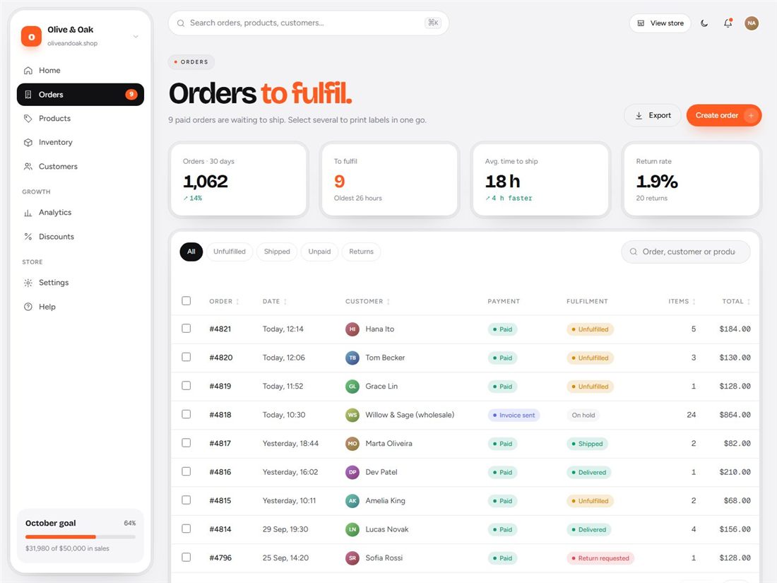
Align numbers to the right, keep row heights generous, and add search, sorting and filters. Use badges for status, but do not rely on colour alone, so the table still makes sense for colour-blind users.
6. Use colour with purpose
Pick a restrained palette: one accent colour for actions and emphasis, and semantic colours for success, warning and error. Check contrast for text and chart labels in both light and dark themes. When every card has a different bright colour, users cannot tell what matters.
7. Give users control without clutter
Date ranges, filters and saved views make a dashboard useful to different people. Put the most common controls within reach, and keep advanced options in menus. A command palette (a search box opened with a keyboard shortcut) helps power users move quickly.
8. Design for every state
Real dashboards spend much of their time in states other than "perfect data". Design for loading, empty, error and no-permission states, and write helpful messages. An empty chart should explain what will appear and how to get data.
9. Plan for small screens and dark mode
People check dashboards on tablets and phones. Reflow cards into a single column, make tables scroll horizontally, and keep tap targets large. If you offer dark mode, test every chart and table in it. A theme switch that remembers the visitor's choice is a small detail that users notice.
Put the principles to work
If you would rather start from a polished foundation, our admin dashboard templates are built on these ideas, with working charts, tables, filters and a dark and light theme: Aurum for finance, Metric for analytics, Cadence for projects, Tillo for e-commerce and Convoy for logistics. Or begin with the free Kite dashboard and read our guide to choosing a free dashboard template.
Ready-made templates for your next project
HTML website templates, admin dashboards and editable business templates, with live previews and instant download.